
Microsoft SwiftKey Keyboard help & learning
Microsoft SwiftKey Keyboard for Android and iOS
Type faster with Microsoft SwiftKey – the smart and customizable keyboard that learns your writing style.
Microsoft SwiftKey gives you more accurate autocorrect and predictions by learning your writing style - including the words, phrases and emoji that matter to you.
Explore Microsoft SwiftKey Keyboard
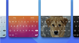
Make it yours
Choose from hundreds of free keyboard themes - or design your own.
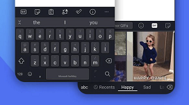
Personalized typing
Customize the toolbar with your favorite typing tools at your fingertips, including GIFs, Clipboard, Translator, Stickers, and more.
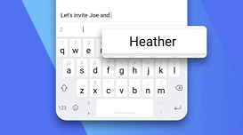
Learns from you
Microsoft SwiftKey learns your writing style to suggest your next word. Enter a whole word with a single tap, instead of typing letter by letter.
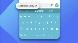
Type in multiple languages
Seamlessly type in multiple languages without switching settings. Choose from 700+ supported languages.
Trending Topics
Get started
How to set up Microsoft SwiftKey Keyboard
How to use the Microsoft SwiftKey Keyboard
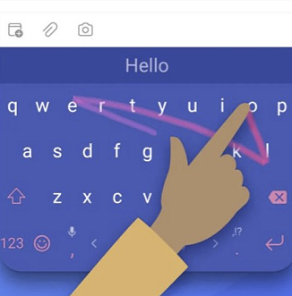
What is Flow and how do I enable it with Microsoft SwiftKey Keyboard?
Account
Microsoft SwiftKey Keyboard: Privacy Questions and your Data
How to use Backup and Sync with Microsoft SwiftKey Keyboard